Case Study / 03
Borago
Brand / Object Concept System
A rebranding case for a cafe and floral space where identity, signage, material atmosphere and brand applications are gathered into one presentation system.
- Concept
- Identity
- Signage
- Applications
Project overview
A botanical identity shaped for a cafe, flowers and memory.
Borago is built around the feeling of borage: a natural, tactile, slightly nostalgic world where cafe, flowers and discovery can meet without becoming decorative noise.
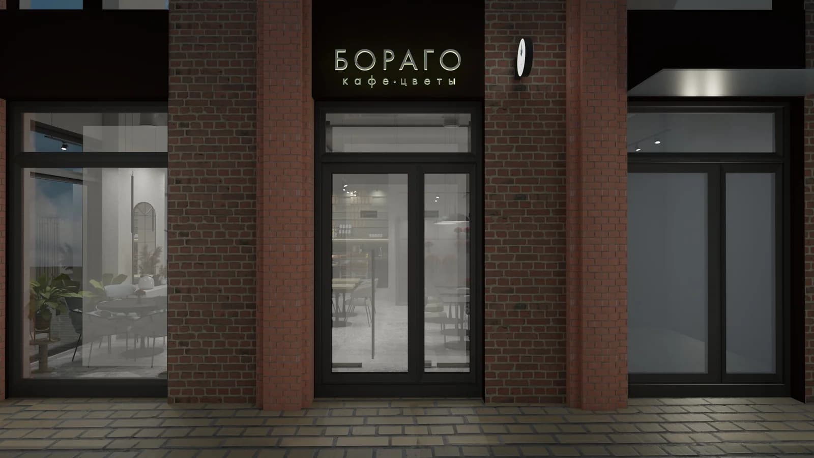
The page uses confirmed case materials, technical signage layouts, brand applications and presentation visualizations. It does not claim documentary photographs of a completed interior, facade or produced merchandise.
Task
Turn a name and sign into a usable brand environment.
The work was not only to draw a logo, but to connect positioning, naming, identity, signage logic, presentation materials and digital framing into one calm system.
Concept
Cafe with the taste of grass, memories and discoveries.Positioning
A warm botanical cafe and floral space, not a generic coffee identity.GVA role
Concept, positioning, naming, identity, logo, signage, brand applications, landing and project presentation.Boundary
Interior images are application context and presentation visualization, not a promise of full-service interior design.Concept
A tactile mood before the graphic system.
The visual language starts from herbs, natural light, rustic textures and botanical memory. These mood images support the direction and are not shown as documentary Borago photography.




Identity
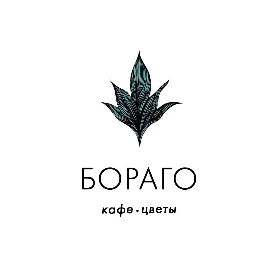
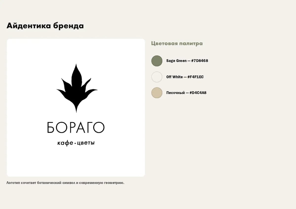
The leaf mark becomes the centre of the system.
The confirmed colour logo is used as the primary identity component. The monochrome silhouette is shown only as an additional adaptation for controlled applications.

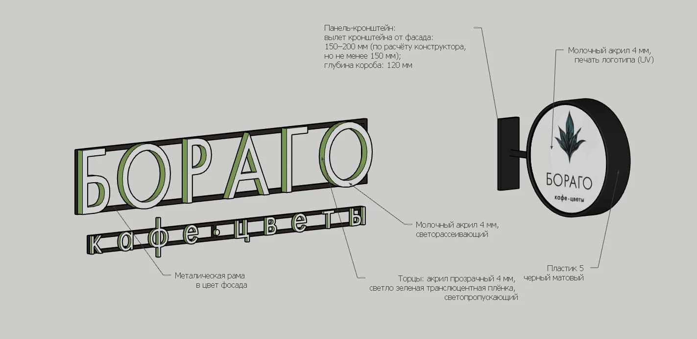
Signage
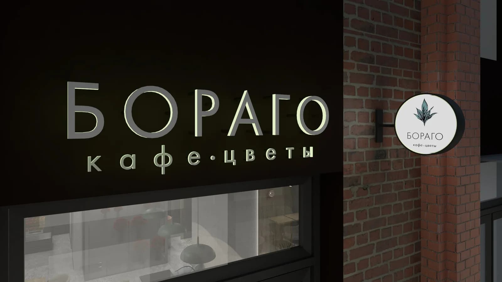
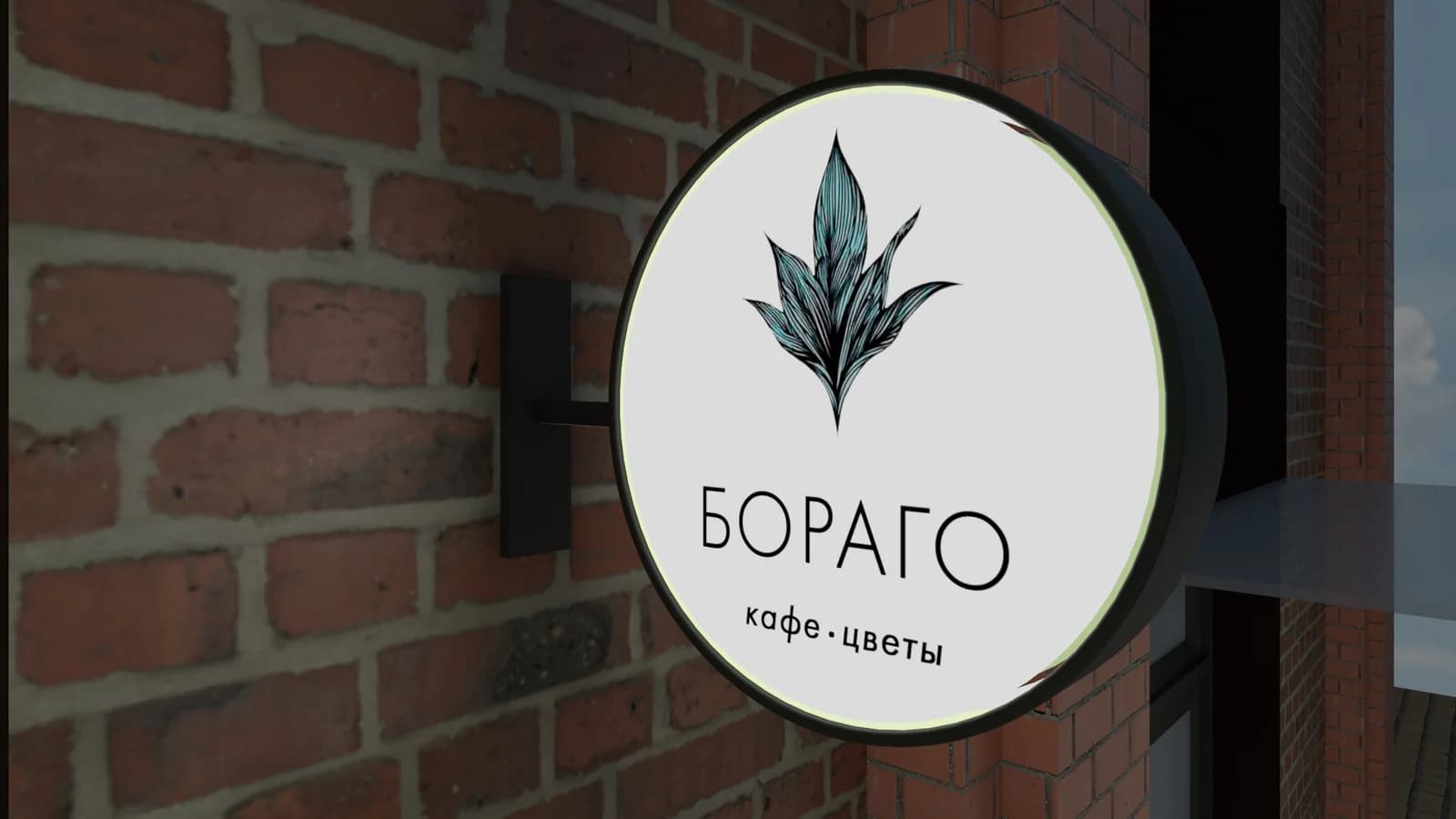
The identity moves from flat mark to exterior object.
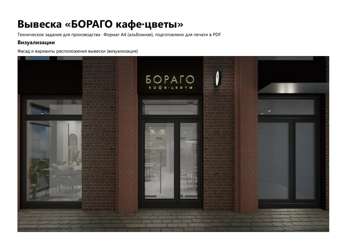
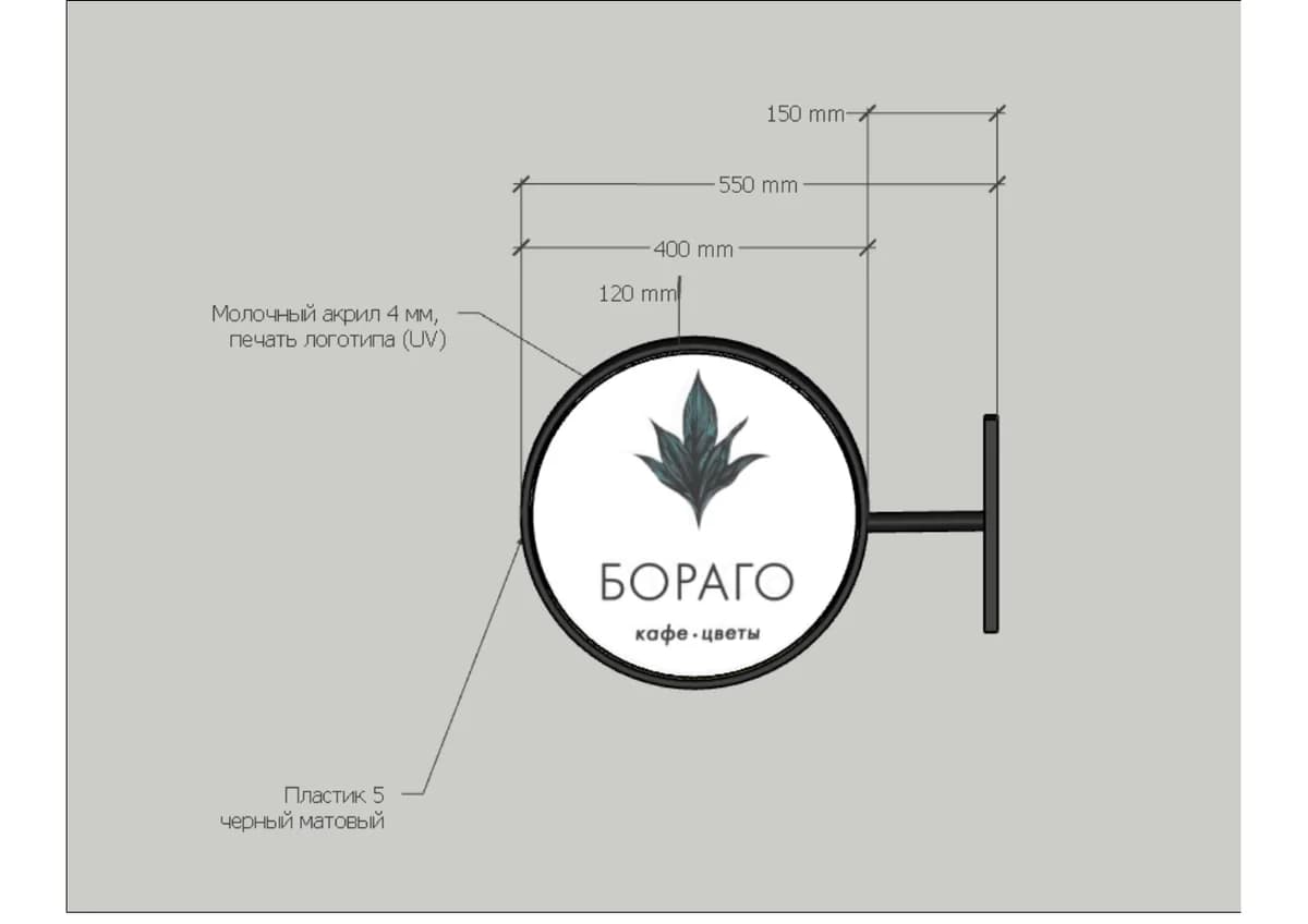
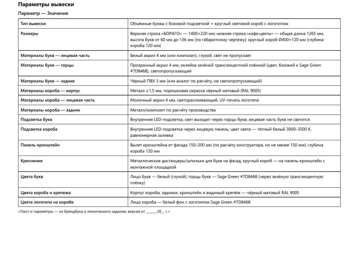
The signage material explains how the logo and wordmark can become a facade composition and a round exterior sign. These are presentation visualizations and technical layouts, not documentary photos of installation.
Technical development
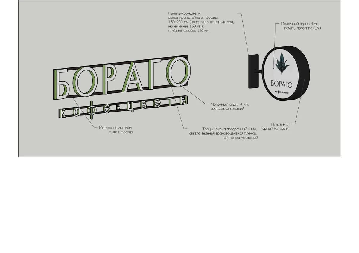
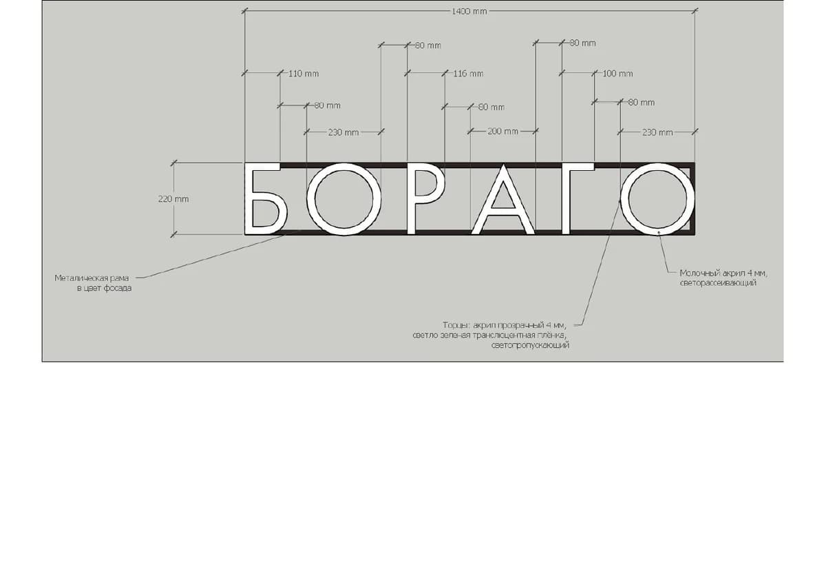
From visual direction to signage specification.
Selected pages from the signage brief show facade placement, construction logic, dimensional drawings and specification. Only selected pages are shown, not the full PDF dump.
Interior context
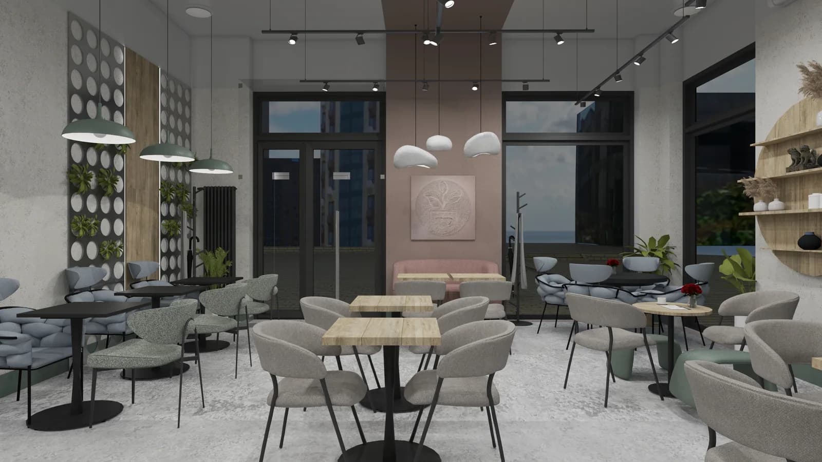
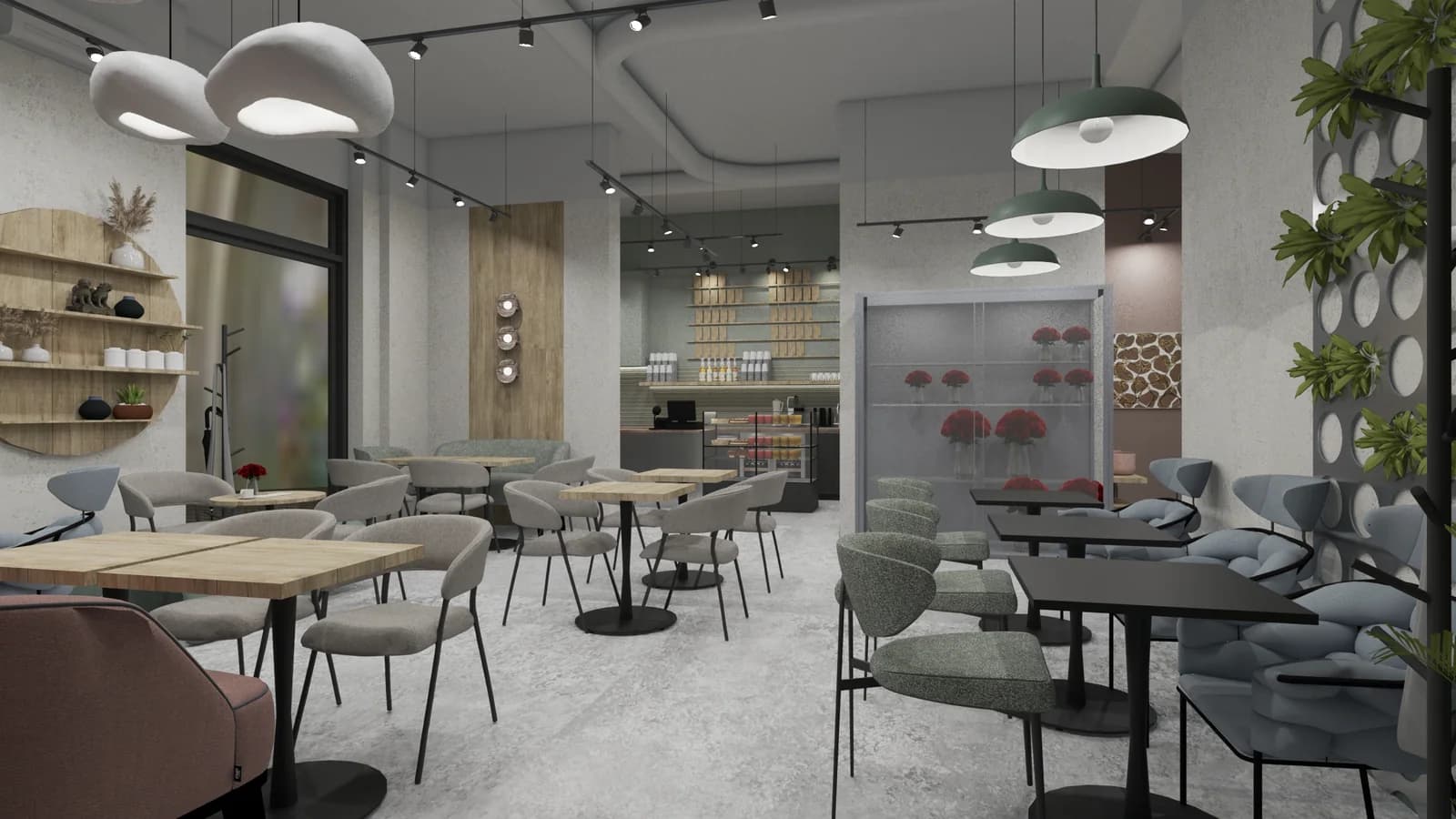
Space as application context, not proof of a built interior.
The two interior views show how the brand atmosphere may behave in space. They are used as project visualizations and should not be read as documentary photographs.
Brand applications
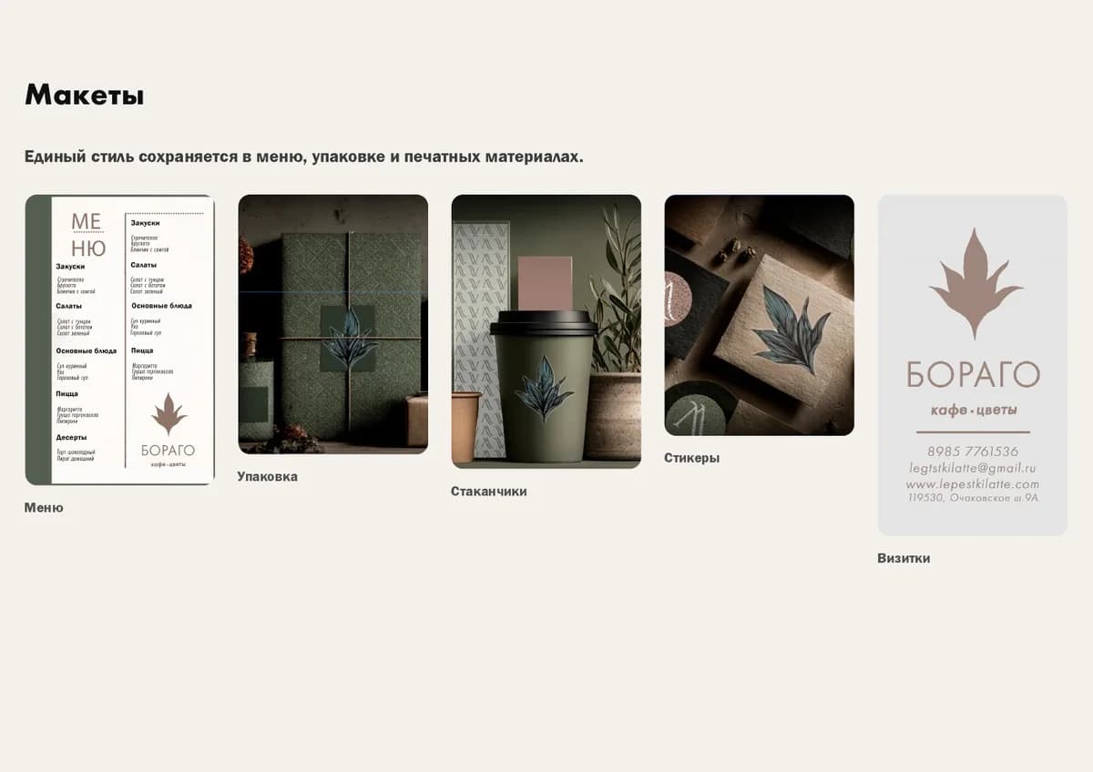
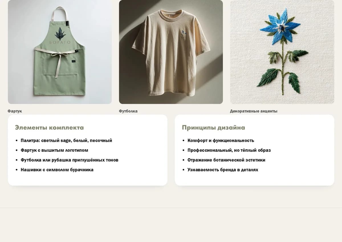
A small family of carriers, kept proportional.
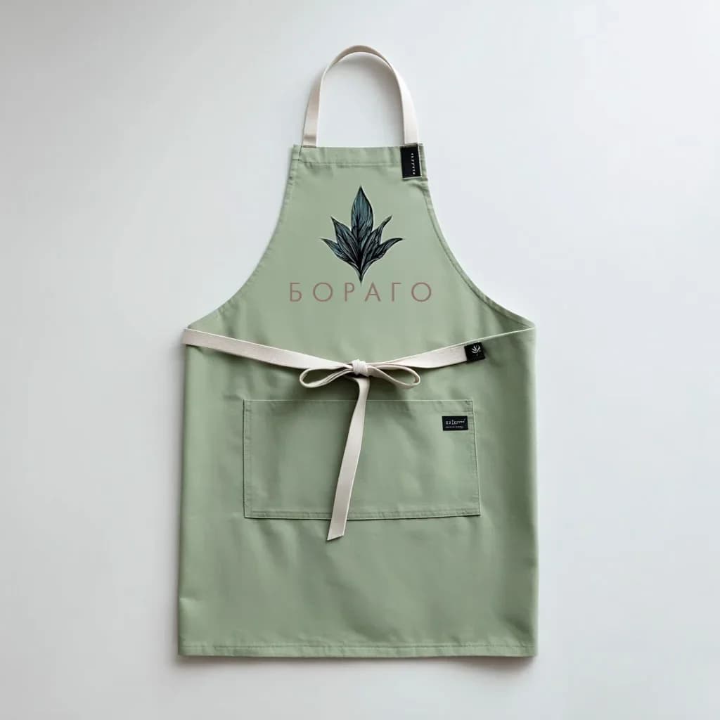
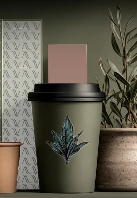
The apron is the strongest application material. The t-shirt, cup, packaging and stickers are shown more compactly as supporting mockups. Business card and menu materials are not published here because contacts, address, dishes and prices require confirmation.



Result
A brand-object presentation system.
Borago remains a secondary proof system for GVA: it demonstrates how concept, identity, signage, applications and project presentation can be aligned without turning GVA into a broad interior studio.
Confirmed
Concept, positioning, naming, identity, logo, signage, brand applications, landing and project presentation.Not claimed
No documentary proof of completed facade, interior, produced signage or merchandise is stated on this page.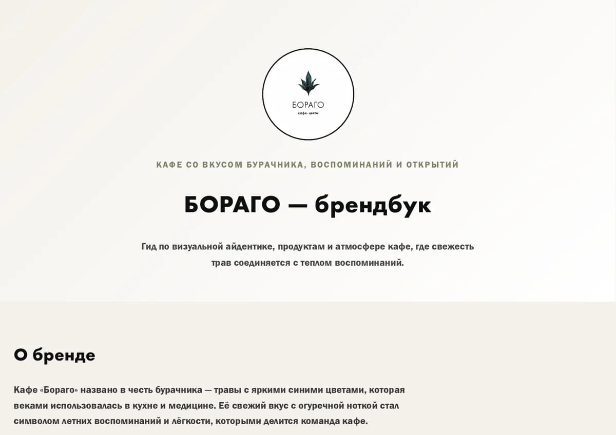
Next step
Discuss a brand-object system.
Start with the idea, sign, material mood or visual direction. GVA will help connect the brand to a clearer object and presentation system.
Discuss an idea